Why More Color Contrast Means Less Clarity

This problem can be avoided very simply by avoiding very strong color contrast between adjacent regions. You might think that a greater color contrast would increase clarity when it actually has the opposite effect. There are two reasons for this. First of all, most people leave the default black ink for writing so when they choose a saturated background color for a cell this makes the writing harder to read. This would happen even if all the cells were the same color. Secondly, when two adjacent cells have different saturated colors your eye is distracted from the content and instead struggles to focus on both at the same time.
This effect was noted by Edward Tufte in his classic book Envisioning Information, an essential guide to the presentation of information. One of the points that Tufte makes is the counter-intuitive fact that more color contrast actually reduces readability, and he illustrates this with a comparison between two maps: one a traditional contour map where adjacent areas are only slightly different and the other the same map with an exaggerated color scale.
 |
| Detail from comparison of two maps in Edward Tufte's "Envisioning Information". The upper half shows a real contour map with low color contrast between adjacent areas. The lower half shows the same image recolored with higher contrast, making it unreadable. |
 |
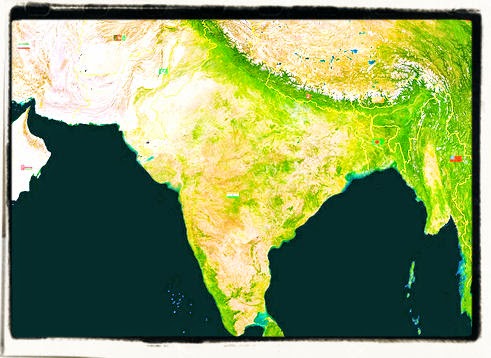
| This map actually found in the wild uses a less exaggerated color contrast than the example from Envisioning Information but the readability is severely impacted. |
Lectures, Workshops, Coaching and Writing
For lectures, workshops, one-to-one coaching and writing on this and other communication topics you can contact me through http://andrewhennigan.com, email conseil@andrewhennigan.com or call 0033 6 79 61 42 81 in France or 0046 730 894 475 in Sweden.


Comments